Today I want to discuss the proper use of boldface in a resume. Boldface is like color – strategic and restrained use is a definite plus. Overuse is dreadful and makes the resume hard to read and more likely to end up in the waste basket. Like color, boldface should be used in the framework of the resume, not in the content.
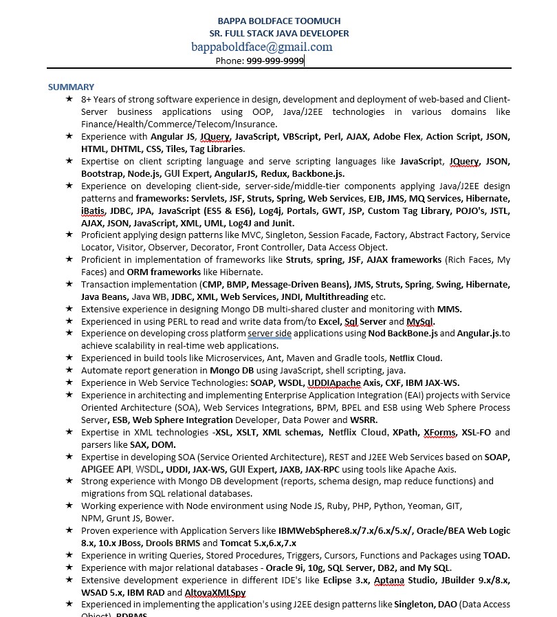
To illustrate how not to use boldface, let’s look at the resume of Mr. Bappa Boldface Toomuch. Bappa is very impressed with all of the technologies he has touched in his life. He is so impressed he has decided to boldface every single one of them. I’m sure his thought is, this draws the reader’s eyes to all of the impressive technologies he knows. Instead, the reader is assaulted with boldface everywhere, to the point where nothing stands out.
This is a classic case of trying to decide for the reader, what the reader should notice. Don’t do that. The reader has a purpose. If your resume has what they are looking for they will find it. As an aside indicator of trying to hard, this person has a one and half page “summary” as part of their 9 page resume!

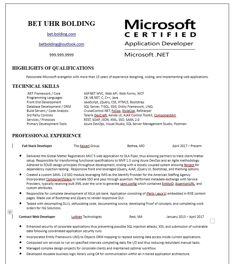
Now let’s take a look at how boldface should be used. In this resume, Ms. Bet Uhr Bolding uses boldface for her name, some well spaced-out headings and some key certifications. Because the boldface is used sparingly, it adds value. It does in fact draw the user’s eyes to certain places and it makes the overall resume look neat and impressive. This resume also illustrates how just a touch of color can look fine. In fact, I think I might have left the web address and email address in black, and changed the Microsoft certification to a pleasant color.
The bottom line is that boldface, like color, and like spices in cooking, can make for a better product. However if you use too much of it, it will turn people off.


50 Comments
Comments are closed.